In this third typography lesson, I bring up the theme.json font style settings as well as line height, font weight, text decoration and miscellaneous settings.
Prerequisites: Global Styles & theme.json.
All code examples in this lesson assume that you are using theme.json version 2 or 3. Remember that you must include the version in your .json file.
Line height
The custom line height is one of the theme.json settings that are not experimental. WordPress supports it without the Gutenberg plugin active:

-In comparison to the font family and font size, it is not possible for developers to choose the values that should be available in the line height control. You can only enable or disable the theme.json line height.
The control starts at the default value: 1,5, and the value is unit less. The lowest possible value is 0, and there is no upper limit. Meaning, you can not use negative values.
This setting is the equivalent of add_theme_support( 'custom-line-height' );.
The learn which blocks support the line height control please see the block reference.
The global styles disable the custom line height by default. You can enable the control by setting typography.lineHeight to true, or, by enabling the appearanceTools.
"settings": {
	"typography": {
		"lineHeight": true
	}
}
Use the following example to add support for line height to a single block:
"settings": {
	"blocks": {
		"core/site-tagline": {
			"typography": {
				"lineHeight": true
			}
		}
	}
}
Or enable it on the root level and disable it for a specific block:
"settings": {
	"typography": {
		"lineHeight": true
	},
	"blocks": {
		"core/site-tagline": {
			"typography": {
				"lineHeight": false
			}
		}
	}
}
Drop cap
The drop cap is a text setting that is only enabled for the paragraph block. The first letter of your text is capitalized and enlarged:
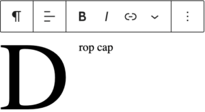
To disable the drop cap, set the value of settings.typography.dropCap to false:
"settings": {
	"typography": {
		"dropCap": false
	}
}
The drop cap is different from the other typography features because it is a block attribute, not a block support.
There is no way to set the position or size of the drop cap using theme.json without using custom CSS. To style the drop cap, you can use the .has-drop-cap:not(:focus):first-letter CSS selector.
The font appearance setting
In the appearance control, you can now select different combinations of regular, italic, and font weights:

Blocks enable this control with two separate block supports: __experimentalFontWeight and __experimentalFontStyle. It is possible for a block to support one but not the other.
Note that if you disable font weight and font style for a text block like a heading, the block toolbar will still have the bold and italic styles available.
Font weight
Font weight is enabled by the block editor by default, and you can select between these values:
- Thin: 100
- Extra Light: 200
- Light: 300
- Regular: 400
- Medium: 500
- Semi Bold: 600
- Bold: 700
- Extra Bold: 800
- Black: 900
Unfortunately, it is not possible to limit the font weights to those supported by the current font family. Many users have requested this feature, but the development team has not built it into Gutenberg yet.
You can disable the font weight control for all blocks with the following code in theme.json:
"settings": {
	"typography": {
		"fontWeight": false
	}
}
And for a single block:
"settings": {
	"blocks": {
		"core/site-title": {
			"typography": {
				"fontWeight": false
			}
		}
	}
}
Font Style
You can turn off the font style (italic) for all bocks by setting typography.fontStyle to false in theme.json:
"settings": {
	"typography": {
		"fontStyle": false
	}
}
How to turn off font style for a single block:
"settings": {
	"blocks": {
		"core/site-title": {
			"typography": {
				"fontStyle": false
			}
		}
	}
}
Text transform
The text transform control inside the typography panel includes the option to change the text to uppercase, lowercase, or capitalized:

It is enabled by default, and you disable it by setting typography.textTransform to false:
"settings": {
	"typography": {
		"textTransform": false
	}
}
Example of how you can disable it for a single block:
"settings": {
	"blocks": {
		"core/site-tagline": {
			"typography": {
				"textTransform": false
			}
		}
	}
}
Letter-spacing
The letter-spacing setting is enabled by default, and you disable it by setting typography.letterSpacing to false.
"settings": {
	"typography": {
		"letterSpacing": false
	}
}
Example of how you can disable it for a single block:
"settings": {
	"blocks": {
		"core/site-tagline": {
			"typography": {
				"letterSpacing": false
			}
		}
	}
}
Text decoration
You can use the text decoration control to add an underline or a line through the text.
Supported by navigation, post title, and read more.
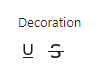
This setting can lead to unexpected results such as duplicate underlines if the theme is also styling link underlines.
If you want to disable the text decoration option, set typography.textDecoration to false:
"settings": {
	"typography": {
		"textDecoration": false
	}
}
Orientation: writing mode and vertical text
The text orientation setting lets users add vertical text. You may have seen this in use in a pattern in the theme Twenty Twenty-Four. This option uses the writing-mode CSS property, and there are plans to also support text-orientation.

writingMode is disabled by default, set it to true to enable it:
"settings": {
	"typography": {
		"writingMode": true
	}
}
Text columns
The text columns block support uses the CSS property “column-count” to display text in two or more columns. For now, there are no WordPress core blocks that support textColumns, but you can also use theme.json for third-party blocks.
Example mockup of what the feature and setting looks like:

The text columns setting is disabled by default, to enable it, you have to set it to true:
"settings": {
	"typography": {
		"textColumns": true
	}
}
Text align
The text align block support and setting is available with theme.json version 3 from WordPress 6.6. For now, this block support is a special case: You can use it to set a default text alignment in the styles section, but there are no WordPress core blocks that support disabling the alignment setting (the controls).
This setting is enabled by default, if you use a custom block that supports textAlign, and you set it the value to false, then the block will not have the text alignment controls.
"settings": {
	"typography": {
		"textAlign": false
	}
}
Applying typography styles with theme.json
These code examples assume that your theme has all typography settings enabled.
Each style option accepts any valid CSS value.
You can add typography styles for the website and as defaults for all blocks in the root level of the styles section in theme.json:
"styles": {
	"typography": {
		"fontStyle": "value",
		"fontWeight": "value",
		"lineHeight": "value",
		"textDecoration": "value",
		"textTransform": "value"
	}
}"styles": {
"typography": {
"fontStyle": "italic",
"fontWeight": "200",
"lineHeight": "1.7",
"textDecoration": "wavy underline",
"textTransform": "uppercase"
}
}Expand to view an example structure with elements (links and headings)
I included the H1 heading in the example. To add support for more headings, repeat the styles for level H2 to H6.
	"styles": {
		"typography": {
			"fontStyle": "value",
			"fontWeight": "value",
			"lineHeight": "value",
			"textDecoration": "value",
			"textTransform": "value"
		},
		"elements": {
			"link": {
				"typography": {
					"fontStyle": "value",
					"fontWeight": "value",
					"lineHeight": "value",
					"textDecoration": "value",
					"textTransform": "value"
				}
			},
			"h1": {
				"typography": {
					"fontStyle": "value",
					"fontWeight": "value",
					"lineHeight": "value",
					"textDecoration": "value",
					"textTransform": "value"
				}
			}
		}
	}
You add styles for individual block types under styles.blocks.blockname.typography:
"styles": {
	"blocks": {
		"core/site-tagline": {
			"typography": {
				"fontStyle": "value",
				"fontWeight": "value",
				"lineHeight": "value",
				"textDecoration": "value",
				"textTransform": "value"
			}
		}
	}
}
Example of applying a default alignment:
"styles": {
	"blocks": {
		"core/media-text": {
			"typography": {
				"textAlign": "right"
			}
		}
	}
}
Resources
The typography block support section in the block reference.