In this exercise, you will practice creating a theme.json file for a WordPress block theme.
You will create presets and add some very basic styling to the theme.
This lesson is suitable for those who want a quick recap of the global styles lesson.
If you created a theme with template parts in the previous exercise, you can continue using it for this exercise. Or, you can download the theme from GitHub.
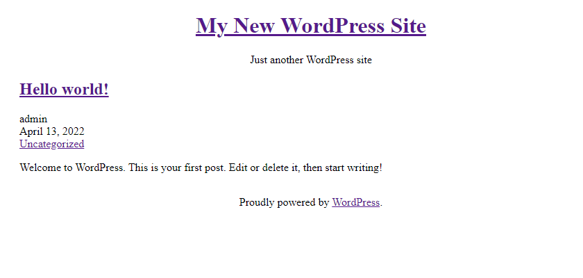
With the help of the theme.json file, we are going to turn this:
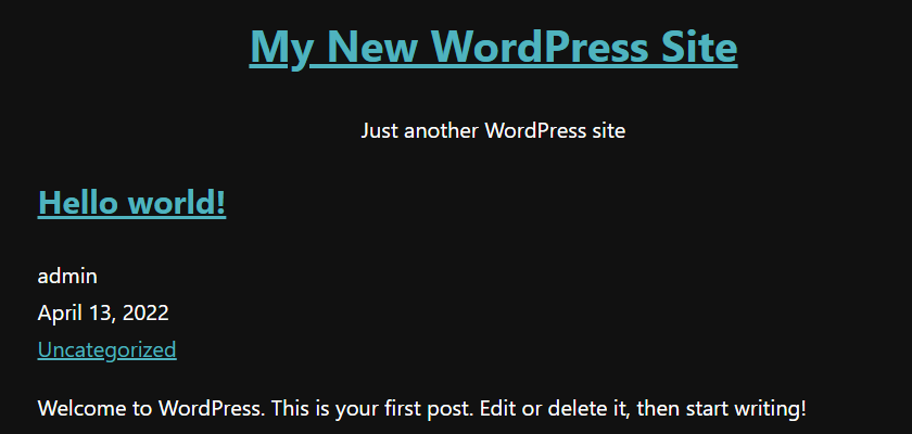
into this:
Creating the theme.json file
Open your theme files in your code editor. In the root theme folder, create a file called theme.json if you haven’t already done so in the previous lessons. The file will have three sections: settings, styles, and templateParts.
I recommend adding one section at a time because a single error in the file can cause other settings to break.
First, you will add the default settings. Default settings apply to all blocks, but you can override them per block.
Start with the opening and closing brackets:
{
}
Inside these brackets, add the schema, version number (3), and the settings section:
{
        "$schema": "https://schemas.wp.org/trunk/theme.json",
        "version": 3,
	"settings": {
	}
}
Color palette
Next, add the first colors to the color palette. Remember to encase the colors with brackets and separate them with a comma. There should not be a trailing comma after the last color.
This setting is the equivalent of the editor-color-palette theme support.
The slug will be used in the generated CSS class, and the name is the visible name in the editor:
{
        "$schema": "https://schemas.wp.org/trunk/theme.json",
        "version": 3,
	"settings": {
		"color": {
			"palette": [
				{
					"slug": "base",
					"color": "#111",
					"name": "Base"
				},
				{
					"slug": "contrast",
					"color": "#fefefe",
					"name": "Contrast"
				}
			]
		}
	}
}
Add a few more colors that you can use in the design of the theme:
{
        "$schema": "https://schemas.wp.org/trunk/theme.json",
        "version": 3,
	"settings": {
		"color": {
			"palette": [
				{
					"slug": "base",
					"color": "#111",
					"name": "Base"
				},
				{
					"slug": "contrast",
					"color": "#fefefe",
					"name": "Contrast"
				},
				{
					"slug": "accent",
					"color": "#383838",
					"name": "Accent"
				},
				{
					"slug": "accent-2",
					"color": "#00838f",
					"name": "Accent Two"
				},
				{
					"slug": "accent-3",
					"color": "#4fb3bf",
					"name": "Accent Three"
				}
			]
		}
	}
}
After the palette, inside colors, add a gradient using the custom color presets you created.
The presets for accent two (light cyan) and secondary (off-white) are converted into these CSS custom properties:
--wp--preset--color--contrast
--wp--preset--color--accent-2
Use the CSS custom properties to define the gradients:
"gradients": [
	{
	"slug": "accent-2-to-contrast",
"gradient": "linear-gradient(135deg, var(--wp--preset--color--accent-2), var(--wp--preset--color--contrast))",
	"name": "Accent Two to Contrast"
	}
]
This setting is the equivalent of the editor-gradient-presets theme support.
Typography
The typography sub-section in theme.json covers font families, sizes, and line height.
Add typography after color (the code is truncated):
{
        "$schema": "https://schemas.wp.org/trunk/theme.json",
        "version": 3,
	"settings": {
		"color": { ... },
		"typography": {
		}
	}
}
Font families
I am adding three sets of font families with this code example: system fonts, sans-serif, and serif. The Name property is the visible name in the editor. If the name is not included, the fontFamily value will be visible instead.
"typography": {
	"fontFamilies": [
		{
			"fontFamily": "-apple-system,BlinkMacSystemFont,\"Segoe UI\",Roboto,Oxygen-Sans,Ubuntu,Cantarell,\"Helvetica Neue\",sans-serif",
			"slug": "system-fonts",
			"name": "System Fonts"
		},
		{
	                "fontFamily": "Geneva, Tahoma, Verdana, sans-serif",
			"slug": "geneva-verdana"
		},
		{
			"fontFamily": "Cambria, Georgia, serif",
			"slug": "cambria-georgia"
		}
       ]
}
Learn more in the lesson dedicated to font family and size.
Font sizes
This setting is the equivalent of the editor-font-sizes theme support.
- The
slugis used in the generated CSS class name. - The size property can be any valid CSS for font sizes, for example, em, rem, or px units.
- The
nameproperty is the visible name in the editor.
Adjust the font sizes that you would like to use in your theme. Basic example:
"fontSizes": [
	{
		"slug": "extra-small",
		"size": "1rem",
		"name": "Extra small"
	},
	{
		"slug": "small",
		"size": "1.125rem",
		"name": "Small"
	},
	{
		"slug": "medium",
		"size": "1.25rem",
		"name": "Medium"
	},
	{
		"slug": "large",
		"size": "1.5rem",
		"name": "Large"
	},
	{
		"slug": "extra-large",
		"size": "2.5rem",
		"name": "Extra large"
	}
]
As you can see, this example is very basic, and it is a good first step for your first theme.json file. You can learn more about font sizes in the dedicated lesson.
Line height
The global styles equivalent of add_theme_support( 'custom-line-height' );.
You can enable custom line heights by adding inside typography:
"lineHeight": true– It is not possible to add a selection of line heights to choose from.
Padding and margin
Next, inside settings, add a spacing section and enable support for custom padding and margin. The units are optional, you can include them all or only select a few.
"spacing": {
	"padding": true,
        "margin": true,
	"units": [ "px", "em", "rem", "vh", "vw", "%" ]
}
Layout
The layout is one of the most important settings in the global styles. In this setting, developers define the default width of the blocks and the width for wide blocks.
"layout": {
	"contentSize": "840px",
	"wideSize": "1100px"
}
View the complete code for the settings section
{
        "$schema": "https://schemas.wp.org/trunk/theme.json",
        "version": 3,
	"settings": {
		"color": {
			"palette": [
				{
					"slug": "base",
					"color": "#111",
					"name": "Base"
				},
				{
					"slug": "contrast",
					"color": "#fefefe",
					"name": "Contrast"
				},
				{
					"slug": "accent",
					"color": "#383838",
					"name": "Accent"
				},
				{
					"slug": "accent-2",
					"color": "#00838f",
					"name": "Accent Two"
				},
				{
					"slug": "accent-3",
					"color": "#4fb3bf",
					"name": "Accent Three"
				}
			],
			"gradients": [
				{
				"slug": "accent-2-to-contrast",
				"gradient": "linear-gradient(135deg, var(--wp--preset--color--accent-2), var(--wp--preset--color--contrast))",
				"name": "Accent Two to Contrast"
				}
			]
		},
		"typography": {
                        "lineHeight": true,
			"fontFamilies": [
				{
					"fontFamily": "-apple-system,BlinkMacSystemFont,\"Segoe UI\",Roboto,Oxygen-Sans,Ubuntu,Cantarell,\"Helvetica Neue\",sans-serif",
					"slug": "system-fonts",
					"name": "System Fonts"
				},
				{
				"fontFamily": "Geneva, Tahoma, Verdana, sans-serif",
					"slug": "geneva-verdana"
				},
				{
					"fontFamily": "Cambria, Georgia, serif",
					"slug": "cambria-georgia"
				}
			],
			"fontSizes": [
				{
					"slug": "extra-small",
					"size": "1rem",
					"name": "Extra small"
				},
				{
					"slug": "small",
					"size": "1.125rem",
					"name": "Small"
				},
				{
					"slug": "medium",
					"size": "1.25rem",
					"name": "Medium"
				},
				{
					"slug": "large",
					"size": "1.5rem",
					"name": "Large"
				},
				{
					"slug": "extra-large",
					"size": "2.5rem",
					"name": "Extra large"
				}
			]
		},
                "spacing": {
	                "padding": true,
                        "margin": true,
	                "units": [ "px", "em", "rem", "vh", "vw", "%" ]
                },
                "layout": {
	                 "contentSize": "840px",
	                 "wideSize": "1100px"
     		}
	}
}
Styling the website
Now that you have created some theme.json presets, you can use them to add styles to the website. At the top level, below settings, add the styles section.
The presets are defined in the settings, but the code in the example is truncated:
{
        "$schema": "https://schemas.wp.org/trunk/theme.json",
        "version": 3,
	"settings": { ... },
	"styles": {
	}
}
Set the body background color to a pleasant dark grey using the preset:--wp--preset--color--base.
Set the text color to the contrast color:
{
        "$schema": "https://schemas.wp.org/trunk/theme.json",
        "version": 3,
	"settings": { ... },
	"styles": {
		"color": {
			"background": "var(--wp--preset--color--base)",
			"text": "var(--wp--preset--color--contrast)"
		}
	}
}
To change the body link color, you need to use elements.
Below color, add elements and then select which element to target; in this case, link:
{
        "$schema": "https://schemas.wp.org/trunk/theme.json",
        "version": 3,
	"settings": { ... },
	"styles": {
		"color": {
			"background": "var(--wp--preset--color--base)",
			"text": "var(--wp--preset--color--contrast)"
		},
                "elements": {
                    "link": {}
                }
	}
}
You can add both typography settings and colors inside elements.link, but I am going to show an example of how to add a link text color:
{
        "$schema": "https://schemas.wp.org/trunk/theme.json",
        "version": 2,
	"settings": { ... },
	"styles": {
		"color": {
			"background": "var(--wp--preset--color--base)",
			"text": "var(--wp--preset--color--contrast)"
		},
                "elements": {
                    "link": {
        		"color": {
 			    "text": "var(--wp--preset--color--accent-2)"
		        }
                    }
               }
	}
}
For the fonts, I am selecting a default font size of 20px or 1.25 rem, which has the preset slug of “medium”, and the system fonts:
{
        "$schema": "https://schemas.wp.org/trunk/theme.json",
        "version": 3,
	"settings": { ... },
	"styles": {
		"color": { ... },
		"elements": { ... },
		"typography": {
			"fontSize": "var(--wp--preset--font-size--medium)",
			"fontFamily": "var(--wp--preset--font-family--system-fonts)",
			"lineHeight": "1.7"
		}
	}
}
And the resulting CSS output is:
body {
	--wp--style--color--link: var(--wp--preset--color--accent-2);
	background-color: var(--wp--preset--color--base);
	color: var(--wp--preset--color--contrast);
	font-family: var(--wp--preset--font-family--system-fonts);
	font-size: var(--wp--preset--font-size--medium);
	line-height: 1.7;
}
Assign content to the template part areas
Finally, add a new section called templateParts at the bottom of theme.json.
The theme that we created in the previous lesson has two template parts: header and footer.
Assign the header.html template part file to the header area and footer.html to the footer area:
"templateParts": [
	{
		"name": "header",
		"area": "header",
		"title": "Header"
	},
	{
		"name": "footer",
		"area": "footer",
		"title": "Footer"
	}
]
Preview
With the styles added, preview the theme on the front to see the result.

Resources
Next steps
If you have completed all five introduction lessons, I recommend you continue working on your theme in the WordPress Site Editor.
I am writing the next lesson; in the meantime, you can read the Introduction to the Site Editor and How to create WordPress themes without coding, a beginner’s guide to creating block themes using the Site Editor and the Create Block Theme plugin.
There are also many more lessons about specific topics on this site, which you can find on the course introduction page.
I encourage you to take this opportunity to learn-by-doing, by working on a real block theme project together with others, in public: Community themes: Learn together by building block themes in public.