In this lesson, you will learn how to use all the theme.json color options, including:
- Site-wide and block specific color palettes.
- Enabling or disabling the default color options or the color picker, gradients, duotone, link, and border colors.
- How to add default colors to blocks.
At the end of the lesson, you will also find answers to frequently asked questions.
Prerequisites: Global Styles & theme.json.
All code examples in this lesson assume that you are using theme.json version 2 or 3. Remember that you must include the version in your .json file.
What colors can you change with theme.json?
The WordPress block editor has many different types of color options, and most can be used in theme.json.
A quick reminder: Settings disables or enables the controls in the editor. Styles applies the default colors.
| Option | Theme.json settings | Theme.json styles |
|---|---|---|
| Background color: Solid and gradient | Yes | Yes |
| Text color | Yes | Yes |
| Link color | Yes | Partial support using elements |
| Link hover color | Part of the link color setting | Partial support using elements |
| Border color | Yes | Yes |
| Heading color | Yes | Yes, using elements |
| Button color | Yes | Yes, using elements |
| Caption color | Yes | Yes, using elements |
| Duotone | Yes | Yes |
| Inline text and background color (Highlight) | No | No |
| Cover block overlay and featured image overlay | No | No |
In the editor, you find most options in the Color panel in the Styles tab in the block sidebar:

Different blocks show different options by default. The link, heading and button controls are often hidden behind the Options menu (the menu with the 3 vertical dots):

Borders, of course, have their own separate panel for selecting border colors.
You may be surprised by some items in this table, because you might not have seen them or used them very often:
- The caption color option is only available in the global styles color panel (Appearance > Editor > Styles sidebar > Colors > Elements > Captions).
- The heading and button color options are available in the global styles color panel, and on container blocks: These options styles blocks inside columns, groups, and cover.
💡If you are wondering why I have not included the shadows, I have written about them in a separate lesson.
What colors can you not change with theme.json?
You may run into problems when you want to apply colors to complex blocks with multiple HTML elements. For example, in the latest posts block it is not possible to add different colors to the post date and post author: not without custom CSS.
Unfortunately it is not possible to add separate palettes or styles for block variations, such as having one palette for the row and another for the stack (Row and stack are variations of the group block). Another feature that is not possible yet is gradient text.
Supported color values
WordPress supports all valid CSS color values in theme.json: Hex, rgb, rgba, color names like blue or red, keywords like transparent and currentColor, hsl, and hsla.
If you prefer, you can reference a CSS custom property (CSS variable). This is is useful when combining theme.json with an existing design system.
There is one important expetion: duotone only works with hex and RGB color values.
Color palettes
There are three types of color palettes: The default palette added by WordPress, a palette that can be added and customized by the user, and the theme palettes. The theme can add any number of palettes, which is why I am calling them palette types.
The default color palette
WordPress registers the default color palette with CSS custom properties that are available for all themes, not only block themes. This ensures that the default colors don’t break if the user switches themes. Even if you disable the default palette or add a new color palette, WordPress still prints the CSS custom properties for these colors.
Expand to view examples of the default color palette.
–wp–preset–color–black: #000000;
–wp–preset–color–cyan-bluish-gray: #abb8c3;
–wp–preset–color–white: #ffffff;
–wp–preset–color–pale-pink: #f78da7;
–wp–preset–color–vivid-red: #cf2e2e;
–wp–preset–color–luminous-vivid-orange: #ff6900;
–wp–preset–color–luminous-vivid-amber: #fcb900;
–wp–preset–color–light-green-cyan: #7bdcb5;
–wp–preset–color–vivid-green-cyan: #00d084;
–wp–preset–color–pale-cyan-blue: #8ed1fc;
–wp–preset–color–vivid-cyan-blue: #0693e3;
–wp–preset–color–vivid-purple: #9b51e0;
How to hide the default color palette
Sometimes, you only want your users and content editors to use your specific brand colors. It is a good idea to hide the default color palette to prevent mistakes. Hide the default palette in the editor by setting it to false in settings.color:
"settings": {
	"color": {
		"defaultPalette": false
	}
}
Or, customize the option for a single block type:
"settings": {
	"blocks": {
		"core/paragraph": {
			"color": {
				"defaultPalette": false
			}
		}
	}
}
How to add a custom color palette
Create your new color palette under settings.color.palette in theme.json. The key and value pairs you need to use are:
- slug: the unique identifier
- name: the visible label in the editor. If you don’t include a name, the color palette will show the color value instead.
- color: a valid CSS color value
💡Avoid reusing slugs from the default palette. If you reuse the same slugs, your color values will not be used unless you also disable the default palette.
List the palette colors inside an array, encasing them with curly brackets and separating them with a comma:
"settings": {
	"color": {
		"palette": [
			{
				"slug": "primary",
				"color": "#7c027c",
				"name": "Purple"
			},
			{
				"slug": "secondary",
				"color": "#420142",
				"name": "Dark purple"
			}
		]
	}
}
WordPress parses the JSON and creates a CSS custom property for each color, and adds them to the root:
:root {
    --wp--preset--color--primary: #7c027c;
    --wp--preset--color--secondary: #420142;
}
These properties are available in addition to the custom properties for the default palette.
Adding a color palette to a single block
You can create separate color palettes for blocks under the blocks section inside the settings section:
settings.blocks.blockname.color.paletteExample:
"settings": {
	"blocks": {
		"core/paragraph": {
			"color": {
				"palette": [
					{
						"slug": "primary",
						"color": "#7c027c",
						"name": "Purple"
					},
					{
						"slug": "secondary",
						"color": "#420142",
						"name": "Dark purple"
					}
				]
			}
		}
	}
}
The block-specific CSS custom properties are not added to the root, but to the block selector:
p {
    --wp--preset--color--primary: #7c027c;
    --wp--preset--color--secondary: #420142;
}
Using multiple color palettes
Since WordPress 6.6, themes can add multiple palettes that the user can choose from in the Color panel in the Styles sidebar in the Site Editor. Once a user has selected one of these color palettes, the available colors are updated across the site.
- The default theme palette is the one you include in theme.json.
- The optional theme palettes are global style variations that only update the color palette. These “color palette variations” use the same format as theme.json and are placed inside the theme’s
stylesfolder.
Gradients
Which WordPress blocks support gradient backgrounds? Please see the list of blocks that support gradients in the block reference.
Default gradients
Just like with the default color palette, WordPress prints the CSS custom properties for the default gradients even if you disable gradients in your theme. This prevents the colors from breaking if the user has used the gradients and then changes themes.
Expand to view examples of the default gradients.
–wp–preset–gradient–vivid-cyan-blue-to-vivid-purple:
linear-gradient(135deg,rgba(6,147,227,1) 0%,rgb(155,81,224) 100%);
–wp–preset–gradient–light-green-cyan-to-vivid-green-cyan:
linear-gradient(135deg,rgb(122,220,180) 0%,rgb(0,208,130) 100%);
–wp–preset–gradient–luminous-vivid-amber-to-luminous-vivid-orange:
linear-gradient(135deg,rgba(252,185,0,1) 0%,rgba(255,105,0,1) 100%);
–wp–preset–gradient–luminous-vivid-orange-to-vivid-red:
linear-gradient(135deg,rgba(255,105,0,1) 0%,rgb(207,46,46) 100%);
–wp–preset–gradient–very-light-gray-to-cyan-bluish-gray:
linear-gradient(135deg,rgb(238,238,238) 0%,rgb(169,184,195) 100%);
–wp–preset–gradient–cool-to-warm-spectrum:
linear-gradient(135deg,rgb(74,234,220) 0%,rgb(151,120,209) 20%,
rgb(207,42,186) 40%,rgb(238,44,130) 60%,rgb(251,105,98) 80%,rgb(254,248,76) 100%);
–wp–preset–gradient–blush-light-purple:
linear-gradient(135deg,rgb(255,206,236) 0%,rgb(152,150,240) 100%);
–wp–preset–gradient–blush-bordeaux: linear-gradient(135deg,rgb(254,205,165) 0%,rgb(254,45,45) 50%,rgb(107,0,62) 100%);
–wp–preset–gradient–luminous-dusk: linear-gradient(135deg,rgb(255,203,112) 0%,rgb(199,81,192) 50%,rgb(65,88,208) 100%);
–wp–preset–gradient–pale-ocean: linear-gradient(135deg,rgb(255,245,203) 0%,rgb(182,227,212) 50%,rgb(51,167,181) 100%);
–wp–preset–gradient–electric-grass:
linear-gradient(135deg,rgb(202,248,128) 0%,rgb(113,206,126) 100%);
–wp–preset–gradient–midnight:
linear-gradient(135deg,rgb(2,3,129) 0%,rgb(40,116,252) 100%);
Use this code if you want to disable the default gradients:
"settings": {
	"color": {
		defaultGradients": false
	}
}
Customizing your gradients
If you’re wondering how to add custom gradients in your theme, the process is very similar to adding a custom color palette. Add an array with one or more gradients under settings.color.gradients. The key and value pairs are:
- slug: the unique identifier
- name: the visible name in the editor
- gradient: a valid CSS gradient value
Instead of specifying a single color value, use any valid CSS gradient such as linear, radial, conic, or repeating — with multiple colors and opacities. Example:
"settings": {
	"color": {
		"gradients": [
			{
				"slug": "pink-to-pale-purple",
				"gradient": "linear-gradient(to bottom right,rgba(255,30,142) 49.9%,rgb(229,6,229, 0.36) 50%)",
				"name": "Diagonal pink to pale purple"
			}
		]
	}
}
Experiment with different shapes and hard stops:
CSS output:
:root {
--wp--preset--gradient--pink-to-pale-purple: linear-gradient(to bottom right,rgba(255,30,142) 49.9%,rgb(229,6,229, 0.36) 50%);
}

.has-pink-to-pale-purple-gradient-background {
    background: var(--wp--preset--gradient--pink-to-pale-purple) !important;
}
Add different gradient options for different WordPress blocks:
"settings": {
	"blocks": {
		"core/group": {
			"color": {
				"gradients": [
					{
						"slug": "pink-to-pale-purple",
						"gradient": "linear-gradient(to bottom right,rgba(255,30,142) 49.9%,rgb(229,6,229, 0.36) 50%)",
						"name": "Diagonal pink to pale purple"
					}
				]
			}
		},
		"core/search": {
			"color": {
				"gradients": [
					{
						"slug": "white-to-grey",
						"gradient": "linear-gradient(90deg, rgb(255,255,255) 0%, rgb(203,203,203) 49%, rgb(255,255,255) 98%)",
						"name": "White to grey"
					}
				]
			}
		}
	}
}
CSS output:
.wp-block-group {
    --wp--preset--gradient--pink-to-pale-purple: linear-gradient(to bottom right,rgba(255,30,142) 49.9%,rgb(229,6,229, 0.36) 50%);
}

.wp-block-search {
    --wp--preset--gradient--white-to-grey: linear-gradient(90deg, rgb(255,255,255) 0%, rgb(203,203,203) 49%, rgb(255,255,255) 98%);
}
Disabling all gradients
To disable all gradients, leave the gradients array empty and set both defaultGradients and customGradients to false:
"settings": {
	"color": {
		"gradients": [],
		"customGradient": false,
		"defaultGradients": false
	}
}
Next is an example of how to disable gradients for a single block:
"settings": {
	"blocks": {
		"core/group": {
			"color": {
				"gradients": [],
				"customGradient": false,
				"defaultGradients": false
			}
		}
	}
}
Duotone
Duotone is a filter where you pair two colors to create effects for videos and images.
Which WordPress blocks support duotone? As of April 2025, the cover block, image, featured image, avatar and site logo supports duotone.
Expand to view examples of the default duotones.
Dark grayscale

Grayscale
Purple and yellow
Blue and red
Midnight (Black and blue)
Magenta and yellow
Purple and green
Blue and orange
Read more about the introduction of duotones in WordPress:
WordPress.org: Coloring Your Images With Duotone Filters
WP Tavern: Duotone Filters: WordPress 5.8 Puts a Powerful Image-Editing Tool Into Users’ Hands
How to add duotone colors
You add new duotones inside settings.color.duotone in theme.json. The key and value pairs are slug, name and colors. Note the plural form: In comparison to the color palette which takes one color value, the duotone takes an array with two color values.
The first color is the shadow, and the second color is the highlight. Separate the values with a comma. If you add more than two colors, the effect will only use the first two colors.
Important: Duotone only works with the hex and rgb color formats:
"colors": [ "#cc1871", "#f9449e" ]Example of how to add a new duotone for all blocks that support the feature (site-wide):
"settings": {
	"color": {
		"duotone": [
			{
				"slug": "pink-and-light-pink",
				"name": "Pink and light pink",
				"colors": [ "#cc1871", "#f9449e" ]
			}
		]
	}
}
And for a single block:
"settings": {
	"blocks":
		"core/cover": {
			"color": {
				"duotone": [
					{
					"slug": "pink-and-white",
					"name": "Pink and white",
					"colors": [ "#cc1871", "rgb(255,255,255)" ]
					}
				]
			}
		}
	}
}
How to disable duotone
To completely disable duotone you need to add an empty array and set both the default and custom duotones to false:
"duotone": []disables the palette"customDuotone": falsedisables the color picker"defaultDuotone": falsedisables the default colors
"settings": {
	"color": {
		"duotone": [],
		"customDuotone": false,
		"defaultDuotone": false
	}
}
How to disable duotone for a single block:
"settings": {
	"blocks": {
		"core/cover": {
			"color": {
				"duotone": [],
				"customDuotone": false,
				"defaultDuotone": false
			}
		}
	}
}
How to disable the custom duotone color picker for a single block:
"settings": {
	"blocks": {
		"core/image": {
			"color": {
				"customDuotone": false
			}
		}
	}
}
Applying a default duotone to image blocks
In this example I am adding one of the default duotones to the image block. Note the use of filter instead of color:
"styles": {
	"blocks": {
		"core/image": {
			"filter": {
				"duotone": "var(--wp--preset--duotone--magenta-yellow)"
			}
		}
	}
}
💡I have monitored the support forums for the default themes, and I have found that many users do not like having a duotone applied by default, and they struggle with how to remove it.
How to enable border color and link color in theme.json
Earlier in the lesson I mentioned the heading, button, and caption color options, which are enabled by default. In contrast, the border color and link color options are disabled by default. And I think this is mostly for legacy and backwards compatibility reasons: They were the first to be added, so enabling them by default now would be a breaking change.
Enable the link color under settings.color.link, and border under settings.border.color:
"settings": {
	"border": {
		"color": true
	},
	"color": {
		"link": true
	}
}
Another option is to enable the settings site-wide, but disable them for specific blocks.
Switch the true and false values to disable link color site-wide and enable them for the single block. The border color option works the same way.
"settings": {
	"color": {
		"link": true
	},
	"blocks": {
		"core/list": {
			"color": {
				"link": false
			}
		}
	}
}
Even if a block does not have a link color control, you can still set default colors with theme.json, but the user can’t change these colors in the interface.
How to disable color options
There are a few different ways to disable color palettes and color options. Remove the color palette from all blocks by leaving the array empty:
"settings": {
	"color": {
		"palette": []
	}
}
Or remove it for a single block:
"settings": {
	"blocks": {
		"core/paragraph": {
			"color": {
				"palette": []
			}
		}
	}
}
Background, text, and link colors etc can be disabled separately:
"settings": {
	"color": {
		"background": false,
		"text": false,
		"heading": false,
		"button": false,
		"link": false,
		"caption": false
	}
}
The link color is disabled (false) by default but added here as an example.
It is not possible to limit which heading levels the color option can be used for. Its all or none.
Here is one final example of how to disable the background color for a single block type.
With this example, the palette for the text color is still available unless it has been disabled globally.
"settings": {
	"blocks": {
		"core/paragraph": {
			"color": {
				"background": false
			}
		}
	}
}
Removing the custom color picker
Disable custom colors and remove the color picker by setting color.custom to false inside the settings section:
"settings": {
	"color": {
		"custom": false
	}
}
Here is how you would disable custom colors for a single block:
"settings": {
	"blocks": {
		"core/paragraph": {
			"color": {
				"custom": false
			}
		}
	}
}
The following code disables the color picker for all blocks except the paragraph:
"settings": {
	"color": {
		"custom": false
	},
	"blocks": {
		"core/paragraph": {
			"color": {
				"custom": true
			}
		}
	}
}
Applying colors with theme.json
In the first part of this lesson, we went through how to add color options to the editor.
Next, I will show you some practical examples of applying colors to blocks in the styles section of theme.json.
One thing to keep in mind is that you are not limited to using presets that you created in the settings section. You can use any valid CSS color value.
Text color
Colors on the root level of the styles section in theme.json are applied to the HTML body.
styles.color.text"styles": {
"color": {
"text": "var(--wp--preset--color--black)"
}
}CSS Output:
body {
    color: var(--wp--preset--color--black);
}
The next example shows how to add a default text color to a single block:
"styles": {
	"blocks": {
		"core/verse": {
			"color": {
				"text": "var(--wp--preset--color--black)"
			}
		}
	}
}
And the resulting CSS output for the verse block is:
.wp-block-verse {
    color: var(--wp--preset--color--black);
 }
Background color
You add the body background color the same way you add the text color:
styles.color.background"styles": {
"color": {
"background": "var(--wp--preset--color--black)"
}
}CSS output:
body {
    background-color: var(--wp--preset--color--black);
}
The code for adding a background for a single block is equally straightforward:
"styles": {
	"blocks": {
		"core/search": {
			"color": {
				"background": "var(--wp--preset--color--black)"
			}
		}
	}
}
CSS output:
.wp-block-search {
    background-color: var(--wp--preset--color--black);
}
How to add a default gradient background to a block
You can add default gradients to supported blocks using styles.color.gradient.
"styles": {
	"blocks": {
		"core/heading": {
			"color": {
				"gradient": "var(--wp--preset--gradient--cool-to-warm-spectrum)"
			}
		}
	}
}
CSS output:
h1, h2, h3, h4, h5, h6 {
    background: var(--wp--preset--gradient--cool-to-warm-spectrum);
}
Applying colors using theme.json elements
You use the elements object to apply styles to links, headings, buttons and more.
Please read this lesson to learn more about elements.
Styling site wide links:
"styles": {
	"elements": {
		"link": {
			"color": {
				"text": "var(--wp--preset--color--secondary)"
			}
		}
	}
}
CSS output:
a {
    color: var(--wp--preset--color--secondary);
}
Use the heading levels H1 to H6 to add default colors to headings:
"styles": {
	"elements": {
		"h1": {
			"color": {
				"text": "var(--wp--preset--color--secondary)"
			}
		}
	}
}
CSS output:
h1 {
    color: var(--wp--preset--color--secondary);
}
Styling buttons:
"styles": {
	"elements": {
		"button": {
			"color": {
				"text": "var(--wp--preset--color--secondary)",
				"background": "var(--wp--preset--color--primary)"
			},
			"border": {
				"color": "var(--wp--preset--color--pale-pink)"
			}
		}
	}
}
You can also add background colors to links:
"styles": {
	"elements": {
		"link": {
			"color": {
				"text": "white",
				"background": "#222222"
			}
		}
	}
}
One use case for the link background color is to style the pagination.
Remember that when you apply styling to blocks, the styles first need to be placed inside the blocks object:
styles.blocks.blockname.elements.link.color.text
styles.blocks.blockname.elements.link.color.background"styles": {
"blocks": {
"core/query-pagination": {
"elements": {
"link": {
"color": {
"text": "#fff",
"background": "#222"
}
}
}
}
}
}Another use case for adding a background color to links is to highlight post titles and read more links, like in this example that the WordPress designer and developer Tammie Lister used on one of their websites:

Styling the post excerpt read more text can seem tricky. -First the block needs to have the link option enabled and a custom read more text, otherwise, there is no link element to style.
In this example, I have included padding to make the background color more visible:
"styles": {
	"blocks": {
		"core/post-excerpt": {
			"elements": {
				"link": {
					"color": {
			"background": "var(--wp--preset--color--pale-cyan-blue)"
					},
					"spacing": {
						"padding": {
							"top": "0.6rem",
							"right": "1rem",
							"bottom": "0.6rem",
							"left": "1rem"
						}
					}
				}
			}
		}
	}
}
Border color examples
All blocks can have a default border added in theme.json. When you add a border color you also need to add a border style for the border to be visible:
"styles": {
	"border": {
		"style": "solid",
		"color": "var(--wp--preset--color--pale-pink)"
	}
}
One use case for adding borders to the body element could be for boxed layouts.
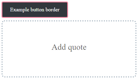
Button block and pull quote code examples:
"settings": {
	"border": {
		"customColor": true,
		"customRadius": true,
		"customStyle": true,
		"customWidth": true
	}
},
"styles": {
	"blocks": {
		"core/button": {
			"border": {
				"style": "solid",
				"color": "var(--wp--preset--color--pale-pink)"
			}
		},
		"core/pullquote":{
			"border": {
				"width": "4px",
				"radius": "10px",
				"style": "dotted",
				"color": "var(--wp--preset--color--cyan-bluish-gray)"
			}
		}
	}
}
Frequently asked questions
It is recommended to use base and contrast followed by primary, secondary, tertiary, and so on as the color slug and name.
Example:
Your background color: “slug”: “base”, “color”: “#ffffff”, “name”: “Base”
Your foreground color: “slug”: “contrast”, “color”: “#111111”, “name”: “Contrast”
If more themes use this naming convention, it will be easier for the user to change themes and keep the color contrast and readability of their existing content.
You can follow the discussion about best practices and the naming convention in this overview issue on GitHub: Default Colors, Theme Colors, and Custom Colors.
This is not possible with theme.json. There was a GitHub issue with a proposal to add contextual palettes, but the issue was closed with the comment that there are no plans to implement this.
Known issues
There is a bug where if you set a default gradient background for the site or for a block, you can’t override the gradient with a solid background color or background image using the interface. This bug has existed a for several years but unfortunately it does not have a solution yet: Its best to avoid it.