With full site editing, you can add new sidebars to any WordPress block theme, even themes that do not originally include sidebars. There are a couple of different ways to create sidebars using blocks. You can use the columns block and add one or more sidebars, create the sidebar as a template part, or add it as part of the content in the block editor.
If you want to use the same sidebar in multiple places, I recommend using the template part method because it will save you time. Editing a template part is similar to adding block widgets to a traditional sidebar. The difference is that you now choose exactly where you want the sidebar to show without depending on a developer to add the code.
There are two questions that I recommend that you ask yourself before creating your sidebars:
- Should the content (the blocks) in the sidebar be the same on every page or post?
- Where should the sidebar content show on small screens like mobile?
You can use the first four headings below to help you decide or skip directly to the section called Creating the sidebar.
This article was written using WordPress 6.2.2 and Gutenberg version 15.9.0. If you are using a different version, the interface may look different.
Estimated reading time: 8 minutes
Last updated
Using the same sidebar on every page
If you want every post or page to use the same sidebar, then you need to edit the default template for single posts and pages using the Site Editor. Of course, if you want to have a sidebar on the front page, archive, and similar, you need to edit the matching template.
In this case, your sidebar should be a template part. Because once you have added the template part to your templates, you only need to update it in one place instead of making the same adjustments in several places.
Using sidebars on only some posts or pages
If you only want to have a single sidebar but only on some posts or pages, you must create a new custom template in the Site Editor and assign it to your posts or pages in the block editor. Do not select the templates called “Single Item: Post” or “Page”.
In this case, your sidebar should also be a template part.
Using different sidebars on different posts and pages
If you plan to use different blocks and create a unique sidebar depending on the post, I recommend adding the columns block directly into your post content using the block editor. Next, move all your content blocks inside the widest column. That way, you can view and edit the sidebar at the same time as you are editing your content.
Sidebars on small screens
The most common layout is to display the sidebar above or below the content on small screens. In a left-to-right environment, a sidebar that is to the left of the content will be above the content. And a sidebar on the right will be below. Because of that, I recommend only using a left sidebar if it has a minimal amount of content or if it contains the post title; because you want your title to come before the content.
Example:
The left column is set to 20%, with the setting “Stack on mobile” enabled.
Post Title
Post content goes here.
Lorem ipsum dolor sit amet, consectetur adipiscing elit. Etiam eu nunc in elit vulputate volutpat interdum vel elit. Nulla facilisi. Donec at semper velit.
Mauris eu ipsum ex. Nam vitae mauris vel leo pretium laoreet. Suspendisse in volutpat nunc, vel efficitur velit. Aliquam sapien erat, aliquet vitae nisi sit amet,
A second example is what I am using on this page, where the left sidebar contains a navigation block, which is hidden behind a menu button on small screens.
Creating the sidebar
Adding a sidebar template part
In this lesson, I use the single post template in the default theme Twenty Twenty-Three as an example.
First, go to Appearance > Editor and open the Template menu. Select the template that you want to add the sidebar to. Insert a new template part block. You can place it anywhere in the editor because you will move it inside the columns block in a minute. Select the option “Start blank”:

In the modal, enter a suitable name, for example, “Post sidebar”.
Adding the columns block and choosing the layout
The post template in Twenty Twenty-Three uses a group for the content located between the site header and site footer. Then it has a second group that contains the featured image and post title. Below the title is the post content block, and finally, the post meta information and the comments area.
The first step is to decide where to position the sidebar, for example, next to the featured image or perhaps below it. You may want to try several options before you make your final decision.
Inside the main group block, add a columns block. I will only add one sidebar, using a two-column layout. You can select the 33/66 variation for a left sidebar or the 66/33 variation for a right sidebar:

Next, move all the blocks related to the post content into the wide column. Move your new template part into the narrow column:
The first block you must add inside the sidebar column is a group block. Using a group will give you more styling options to choose from. For example, the column has basic border settings but not border-radius, which is available for groups.
– But you also need the group because the column block can not use other HTML elements than a <div>. More on that under Accessibility concerns and tips.
Add the rest of your blocks to the sidebar inside the group. Maybe you want a traditional sidebar with the latest posts, the latest comments, and a search field. Or maybe, you plan to display ads, an author biography, or a newsletter signup.
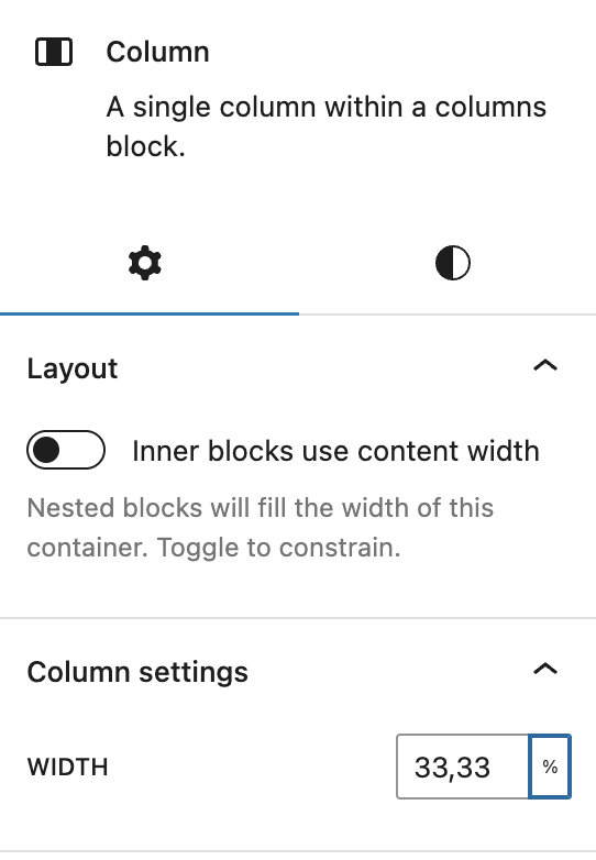
In the column settings, you can adjust the width of the content area and the sidebar.
Add a numeric value, and choose between the following units: %, pixels, em, rem, vh, vw.

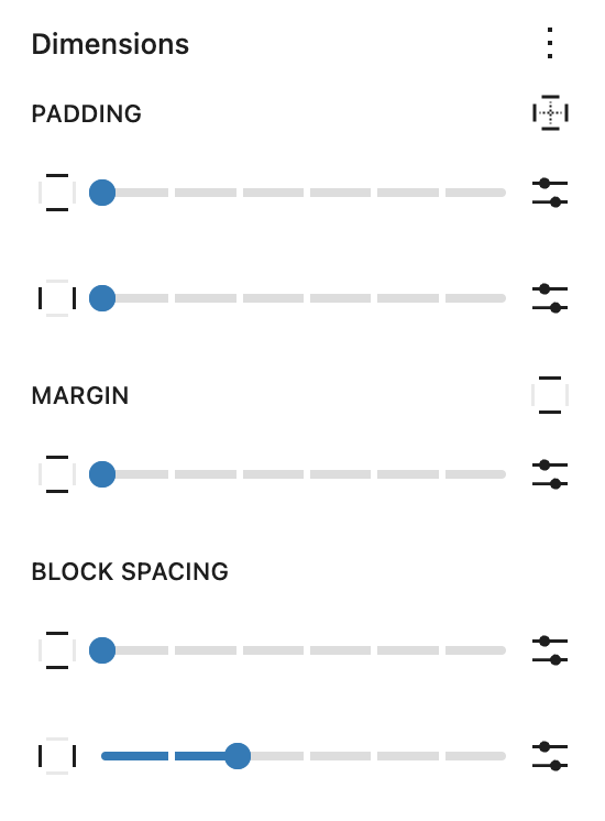
By selecting the parent columns block, you can adjust the space between the content blocks and the sidebar. Open the block settings sidebar and select the Dimensions panel, and adjust the block spacing:

Accessibility concerns and tips
In a left-to-right environment, users of assistive technology can read the content from the top left to the bottom right of the page. Or, for example, navigate the content by selecting from a list of headings (There are many more ways to navigate, but I won’t bring them up in this lesson).
Your post or page title should be a heading that describes the content, so it is important that you do not place the title after the content, like in a sidebar on the right side. The same rules apply to right-to-left environments, except for the left side. If you use the table of contents, time to read, or navigation blocks, these should also be placed before the content.
If your sidebar contains complementary content like lists of links to other posts, category archives, advertising, or latest comments; then your sidebar should use the <aside> HTML element. One exception to this is if your sidebar only contains navigation blocks.
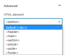
You do not need to know how to code to change the HTML element. You can update it by selecting the group inside the sidebar column and opening the Advanced panel in the block settings sidebar. There, find the HTML element option, and select <aside> in the select list:

Wide and full-width content will not look the same in the editor and front
If you are using a block theme template with a sidebar, then the sidebar is not visible in the block editor, only on the front and in the site editor. That means that the sidebar does not take up space in the block editor. So when you add wide or full-width blocks, they make look wider in the block editor than on the front of the website. There is no good way around this mismatch, but I wanted to mention it in case you ran into the problem and found it confusing.