Did you know that the block editor and full site editing have built-in features for creating accessible websites? The enhancements to the block editor are beneficial for both developers and editors.
The accessibility features in full site editing themes focus on solving common accessibility problems found in classic themes. The WordPress.org themes team has been able to identify focus areas from years of reviewing themes for the official theme directory.
In this article, I am using the requirements for the accessibility-ready tag in the theme directory as a guideline. I will add notes about how well block themes live up to the requirements out of the box, and what theme authors can do to improve their themes.
— This article focuses on the accessibility of the front of the website and do not bring up accessibility problems in the block editor.
Prerequisite: Basic knowledge of web accessibility
Estimated reading time: 10 minutes
Updated May 20, 2022.
Can a full site editing theme be accessibility-ready?
Yes, full site editing themes can be accessibility-ready. As a theme developer it might even be easier to create an accessible block theme than a classic theme. This is because full site editing moves some of the responsibility from the theme developer to WordPress.
It is the responsibility of WordPress to provide blocks that are accessible. And it is up to the theme developer to use the blocks correctly and not break the block’s accessible features.
Criteria
You can read the requirements for the accessibility-ready tag on WordPress.org:
Keyboard Navigation
Provide visual keyboard focus highlighting in navigation menus and for form fields, submit buttons, and text links. All controls and links must be reachable using the keyboard.
Navigation menus
The navigation block is keyboard accessible on the front of the website by default.
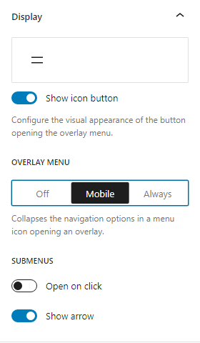
You can open submenu items on hover and by using a button with an aria-label, the aria-expanded attribute, and an SVG icon with aria-hidden=true and focusable="false".
The block has an option called “Open on click”. The option turns the parent menu item into a button that expands the submenus.
You can choose between always showing the menu, hiding it on small screens, and hiding it on all screen sizes. The buttons that open and closes the navigation are keyboard accessible; you can also close the navigation by using the escape key.
You can choose to use the menu button with a two line icon, or display the text “Menu”.
The text is translatable, but not editable.
Potential issues:
When you enable the option “Open on click” option and open the responsive navigation, the parent menu item is still a clickable button. This button does not do anything, because the overlay menu already expands all the submenu items.
Forms
There are only two types of WordPress core blocks that use forms: Search and comments.
The category and archive blocks use a select list and a label. They do not use a form element, submit buttons or editable input fields.
The blocks have a visible focus outline, but the color contrast will depend on the active theme.
Controls
All theme features that behave as buttons or links must use <button>, <input>, or <a> elements, to ensure native keyboard accessibility and interaction with screen reader accessibility APIs.
All controls must also have machine-readable text to indicate the nature of the control.
The buttons in the navigation block, search block, and comments are HTML buttons or submit buttons and have machine-readable text.
The button block is a link element (<a>) and this is correct because they do not perform an action; they lead to a different part of the website.
Potential issues:
Early versions of the search block, category, and archive block did not have labels.
Skip links
In block themes, WordPress adds the skip link automatically if the page contains a <main> element. The link is visually hidden until you focus on it, and it is the first focusable item on the page. It always skips to the <main> element.
Theme authors do not need to set up or enqueue a skip link JavaScript file, but they need to ensure that they are using one <main> element on each page.
Code reference: the_block_template_skip_link()
Forms
Comment forms must have appropriate field labels, and all content within form tags need to be explicitly associated with a form control.
Post-submission responses (errors or confirmations) must be perceivable.
Placeholder attributes are not valid replacements for a label.
The comment form blocks pass these criteria.
— A potential issue is maintaining the accessibility if the comment form is split into separate, editable blocks, which is the plan for Gutenberg.
Headings
Theme templates must use a reasonable HTML heading structure — including the use of heading elements for page sub-sections.
Heading markup must not be used for presentational purposes.
Recommended:
Headings do not skip levels when descending. H1 cannot be followed by H3, etc.
Multiple H1 is acceptable but highly discouraged. Having one H1 is beneficial for screenreader users.
The theme author shares the responsibility with the content editor.
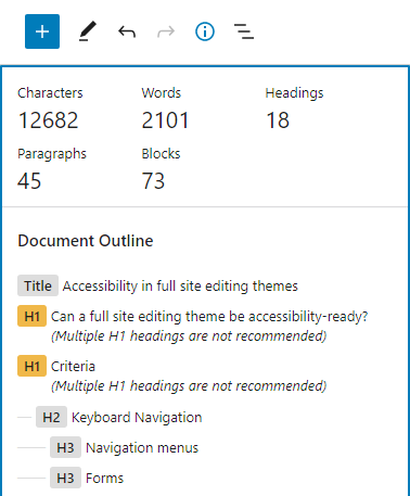
The block editor has a built-in document outline that warns if there are heading levels that are in the wrong order. This tool is not available in the Site Editor, and theme authors need to ensure that they use the correct heading structure in the theme’s default templates.
One of the reasons why the multiple H1’s are acceptable, is that there is no way to adjust the heading level depending on if you display the heading on the home page or an inner page: Not without using different template parts.
ARIA Landmark Roles
Assign landmark roles to the main content areas of your site. All content on your site must be wrapped in at least one landmark role; any content not wrapped in a landmark role is ‘orphaned’, and may not be found by screen reader users.
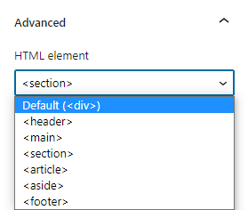
Theme authors create landmarks by changing the HTML element of their container blocks: group, template part, query, and comments.
You can change the tag by updating the tagName attribute in the markup or selecting the HTML element in the Advanced settings panel in the block settings sidebar.
Different blocks have different HTML tags available: Div, header, main, footer, section, article, and aside. Nav is available in the markup, but not in the interface.
Aria labels
If a particular role appears more than once on a page, provide an ARIA label for that role.
This is one requirement where full site editing themes are not as flexible as classic themes. Adding an aria-label in the markup of a block will sometimes cause a block validation error.
Having a descriptive aria-label when there are multiple navigation blocks is important for any user who navigates via landmarks. The navigation block automates this in WordPress 6.0, by using the menu name as the aria-label.
The aria-label does not have a separate input field and can not be different from the name. It is important that the user adds a descriptive name instead of the default menu name.

— There is a potential issue if you duplicate the navigation block in the editor, since the editor does not update the name.
Because the navigation block requires a stored navigation ID to add the aria-label, you can not add the aria-label in the HTML block markup, therefore, there is nothing the theme author can do to add the aria-label.
Content Links
Links within large sections of text (e.g., post content or comments) must be underlined.
When links appear within a larger body of block-level content, they must be clearly distinguishable from surrounding content.
The underline is the only accepted method of indicating links within content.
Bold, italicized, or color-differentiated text is ambiguous and will not pass.
Links in navigation-like contexts (e.g. menus, lists of upcoming posts in widgets, grouped post meta data) do not need to be specifically distinguished from surrounding content.
Links for headings and paragraph blocks have underlines by default, and it is up to the theme developer to not break this requirement by removing the underlines.
Most blocks do not have controls for removing or adding underlines, the exceptions are the navigation block and the read more block.
Repetitive Link Text
Links must avoid repetitive non-contextual text strings such as ‘read more…’ and must make sense if taken out of context.
Bare URLs must not be used as links.
Here, the Gutenberg developers made a decision to allow a customizable “read more” text block and excerpt block, rather than having static text that could be combined with the post title. Editors can update the text to pass the requirements, or choose to not use the block.
Contrasts
Theme authors must ensure that all background/foreground color contrasts for plain content text are within the level AA contrast ratio (4.5:1) specified in the Web Content Accessibility Guidelines (WCAG) 2.0 for color luminosity.
If a change in color is the only visible change when the link state changes:
The text color on hover must have a contrast ratio of 4.5:1 against the default link text color and against the focused link text color.
The text color on focus must have a contrast ratio of 4.5:1 against the default link text color and against the hovered link text color.
If there is no text decoration on linked text, there must be a 3:1 color contrast between the link text color and the surrounding non-link text color, in addition to the other color contrast requirements.
Theme authors and editors share the responsibility of ensuring that the color contrast is high enough. They can use the built-in color selection tool in the block editor which gives a warning if the contrast is too low. You can use the tool to test both links and plain text against the background color.
This requirement may first seem difficult, but it mostly applies to links that have no underline; as the theme developer, you can prevent failure by not removing underlines on links.
It requires additional styling to some blocks including the navigation block.
Images
Where theme authors add non-decorative images to template markup or provide a method for end users to add images, theme authors MUST incorporate an appropriate alt attribute or the means for an end user to provide one.
All decorative images must be marked up such that they will be ignored by screen readers.
This requirement has not aged well since it is the block editor, not the theme author, that is responsible for providing means for inserting images and alt texts. Not all image blocks have alt text settings in the editor, but alt texts can be provided in the block markup or via the media library.
Full site editing and the block editor do not support inserting custom svg icons out of the box, and if the theme author implements it, they need to make sure it passes the requirements.
Media
Media resources must NOT auto start or change without user action as a default configuration. This includes resources such as audio, video, or image/content sliders and carousels.
The video block has an option for autoplay, and theme authors and editors can follow this requirement by not enabling the option. If the theme needs to recommend a third-party content slider, please ensure that it is accessible.
Screen Reader Text
If you are making text available only for screen reader users, there are two valid ways to do this. You can either use text hidden in a valid screen-reader-text class or use aria-label or aria-labelledby attributes to provide an accessible name for what you’re labeling.
The block editor does not provide an interface for adding screen reader texts. Theme authors can implement screen reader texts by adding a custom CSS class and the appropriate styling.
But be careful when deciding what to show in the editor and what to show on the front, especially if you intend for users to customize the texts.
Conclusion
The four main things you need to focus on to create accessible block themes are:
- Using the correct semantic elements in templates (header, main, footer)
- Color contrast
- Underlining links
- Heading order
Please also be careful to not break the functionality of the navigation block when you want to use custom CSS beyond spacing and colors.
If you are using or recommending custom blocks, you need to ensure that those too are accessible.